


Documentation
Setup, custom data, and every setting and section, written for the theme editor.
Read the docsA Shopify theme for furniture and home stores
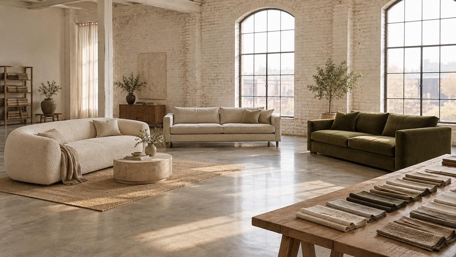
Nook is a Shopify (opens in a new tab) theme for brands selling considered pieces: made-to-order sofas and tables, lighting, outdoor furniture. Three styles, calm editorial pages, and size, material and delivery shown clearly.
Section 1: Three styles
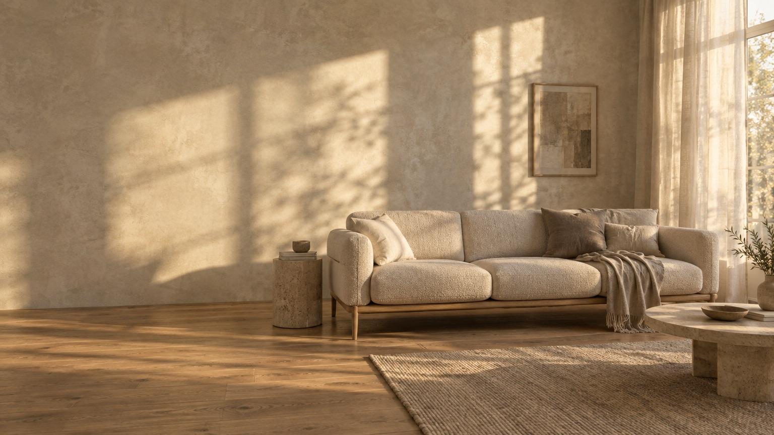
Each style has its own colors, fonts, layout and home page, made for a different kind of store. Pick one when you add Nook, then change any of it in the theme editor.
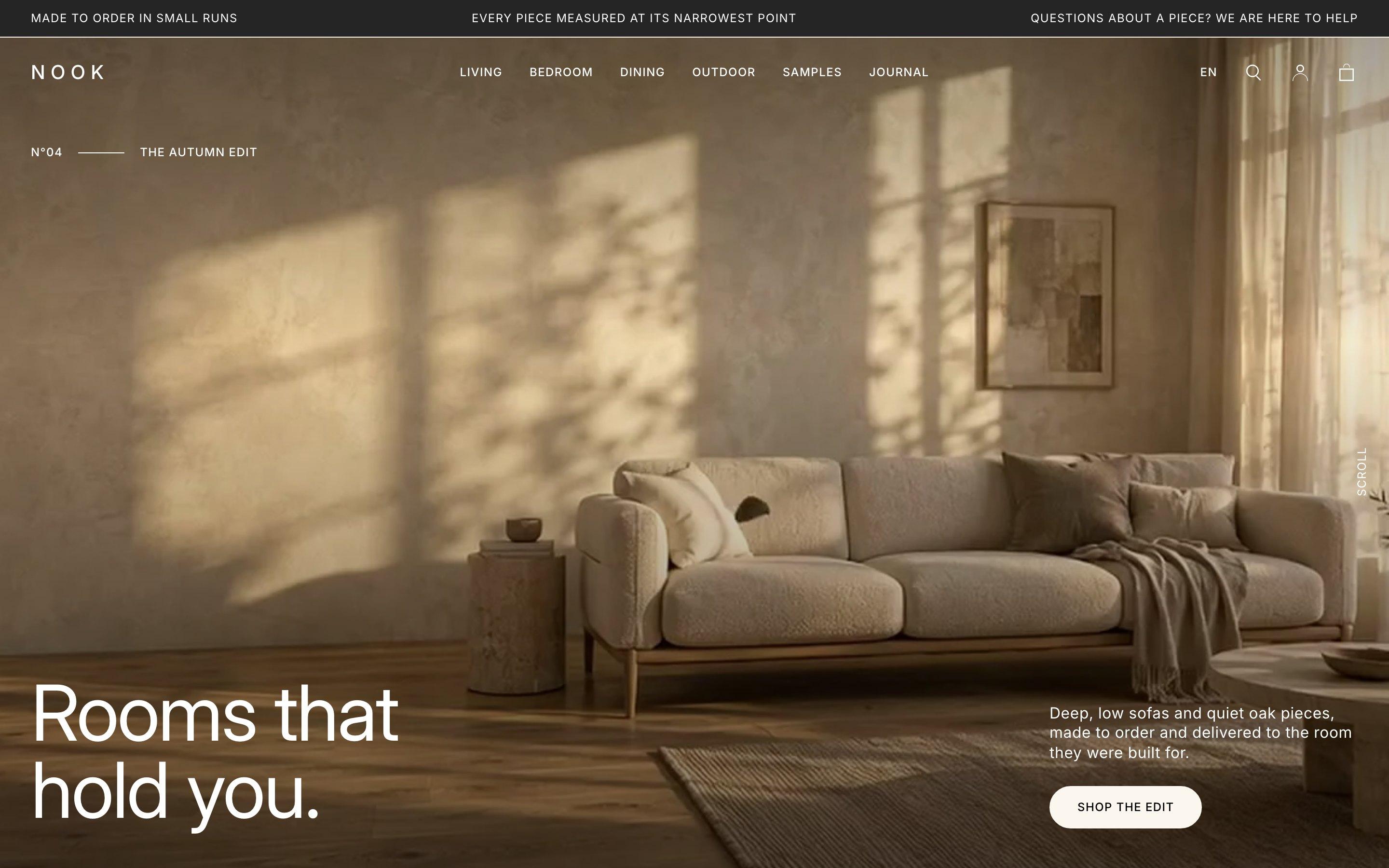
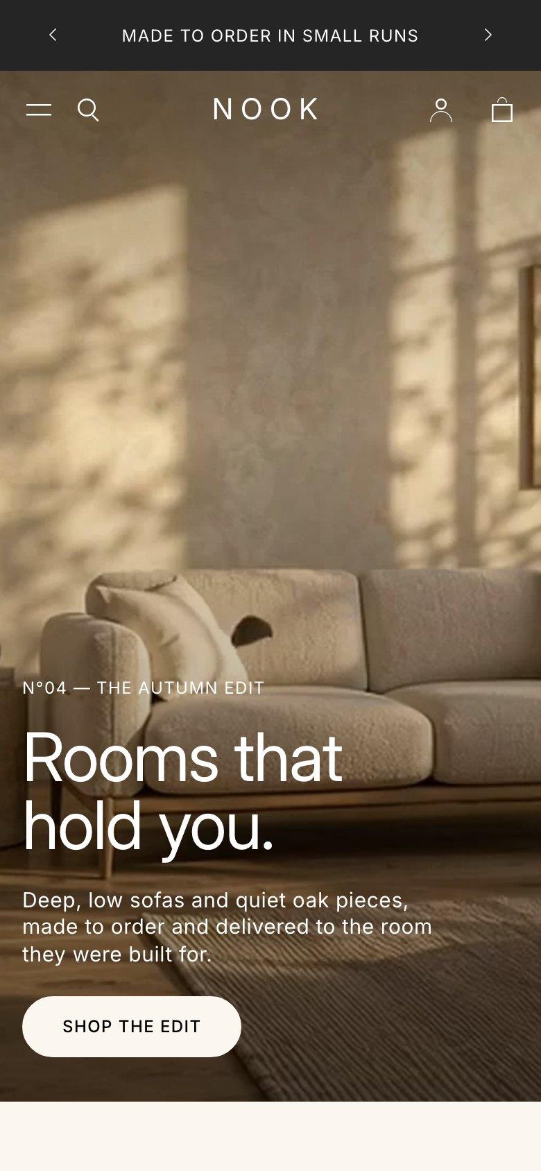
For furniture stores
Light and editorial, set in Inter. Suited to made-to-order sofas, beds and oak furniture.
Color schemes
A style only sets starting values. Colors, fonts and sections all stay editable.
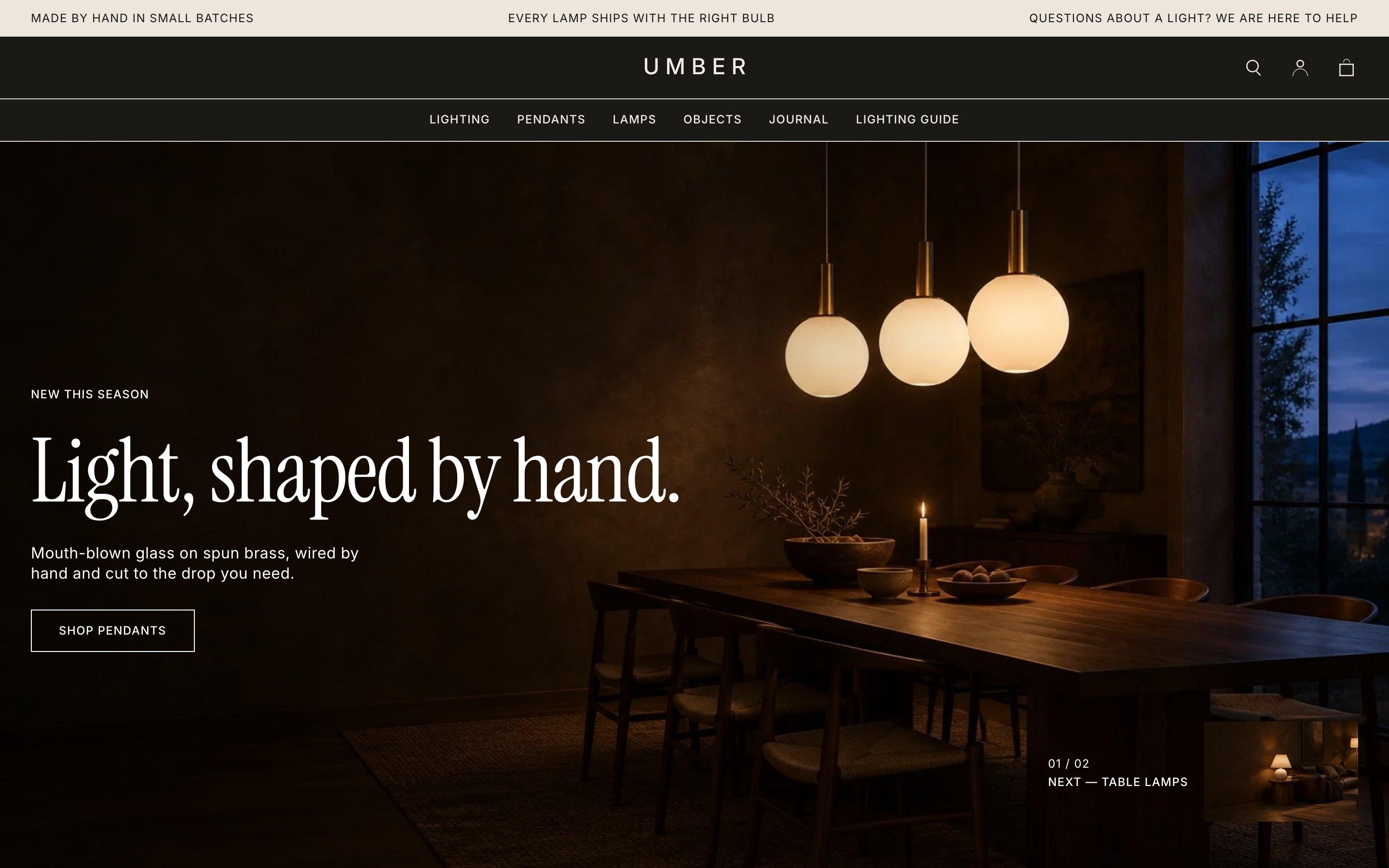
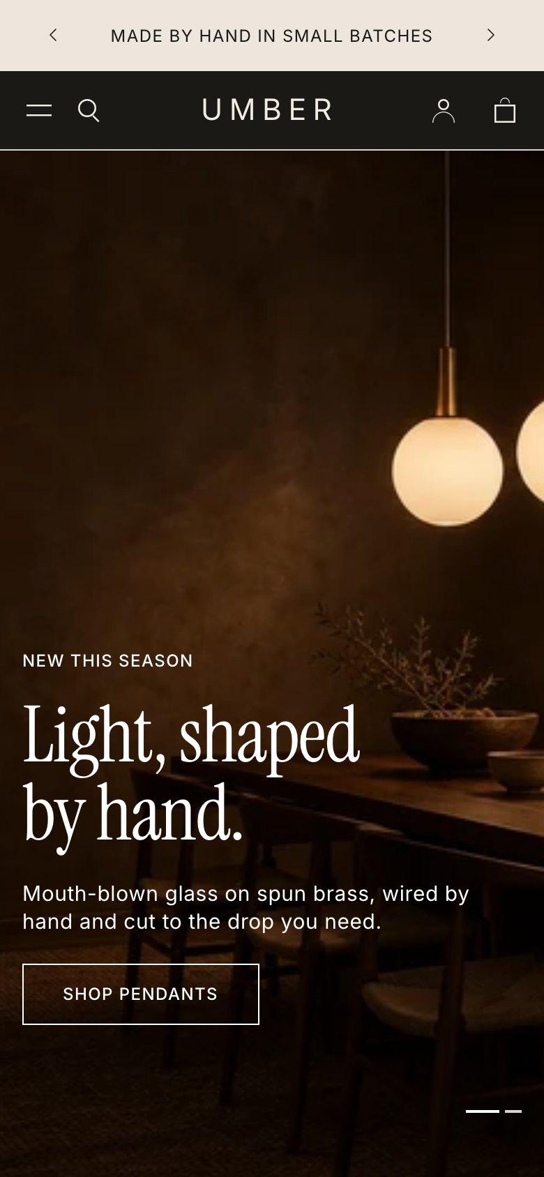
For lighting and home accents
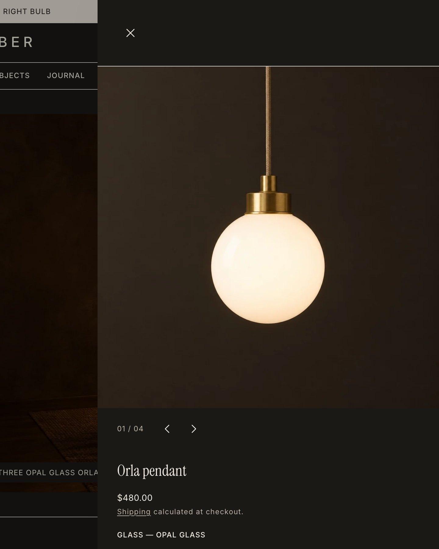
Dark and gallery-like, with Instrument Serif headings. Product first, for a catalog of lamps and objects.
Color schemes
A style only sets starting values. Colors, fonts and sections all stay editable.
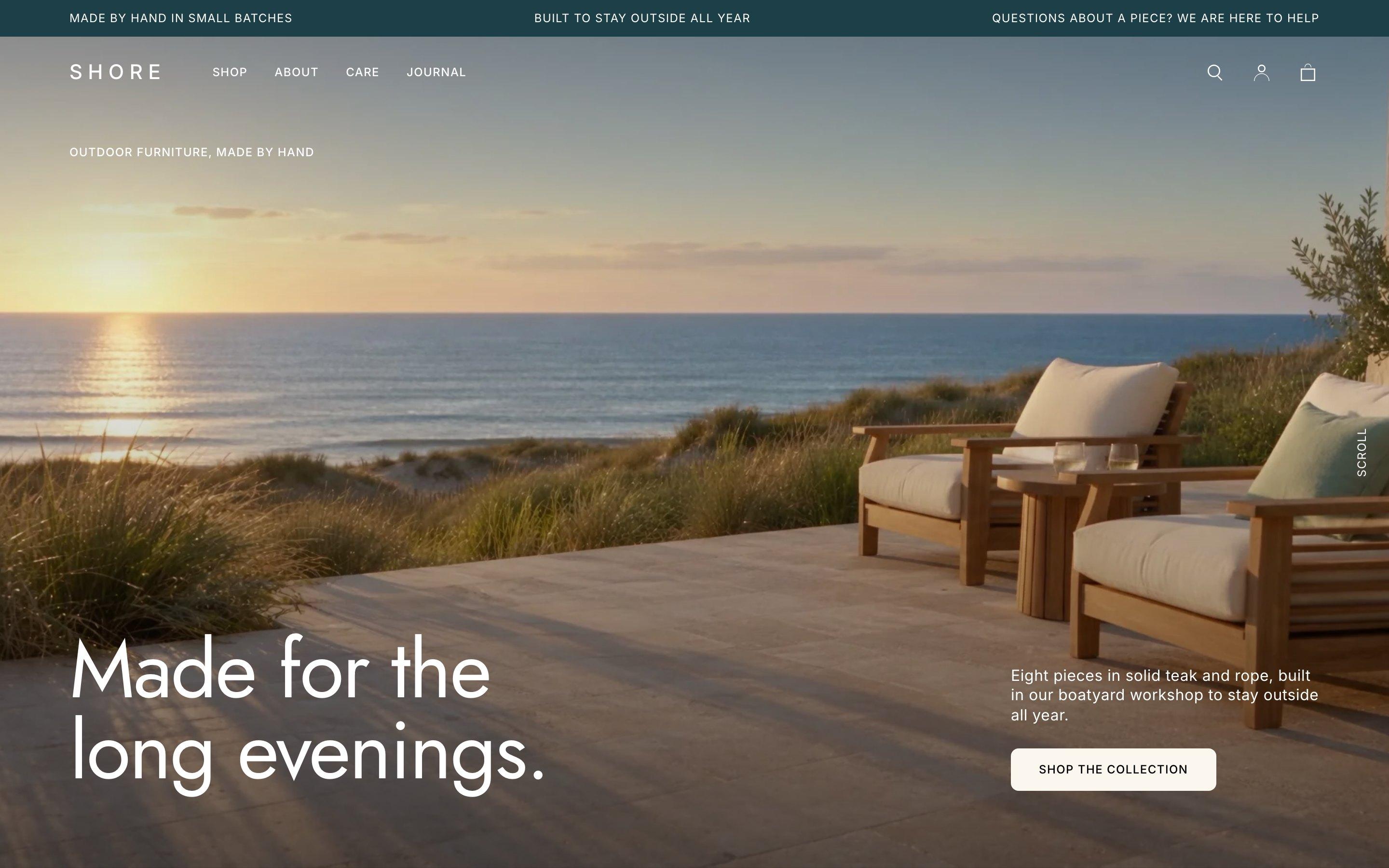
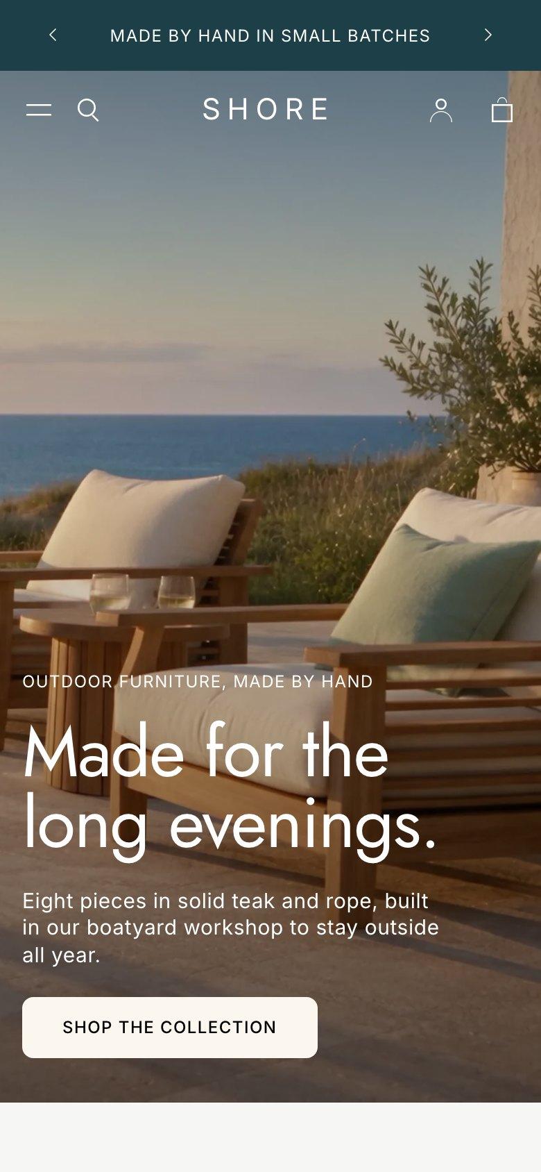
For outdoor furniture
Bright, cool and coastal, with Jost headings. Suited to a small maker with a few pieces to show well.
Color schemes
A style only sets starting values. Colors, fonts and sections all stay editable.
Furniture is bought slowly. Nook gives each piece room, then answers the questions that come before the cart: will it fit, what is it made of, and when will it arrive.
Section 2: Built for furniture
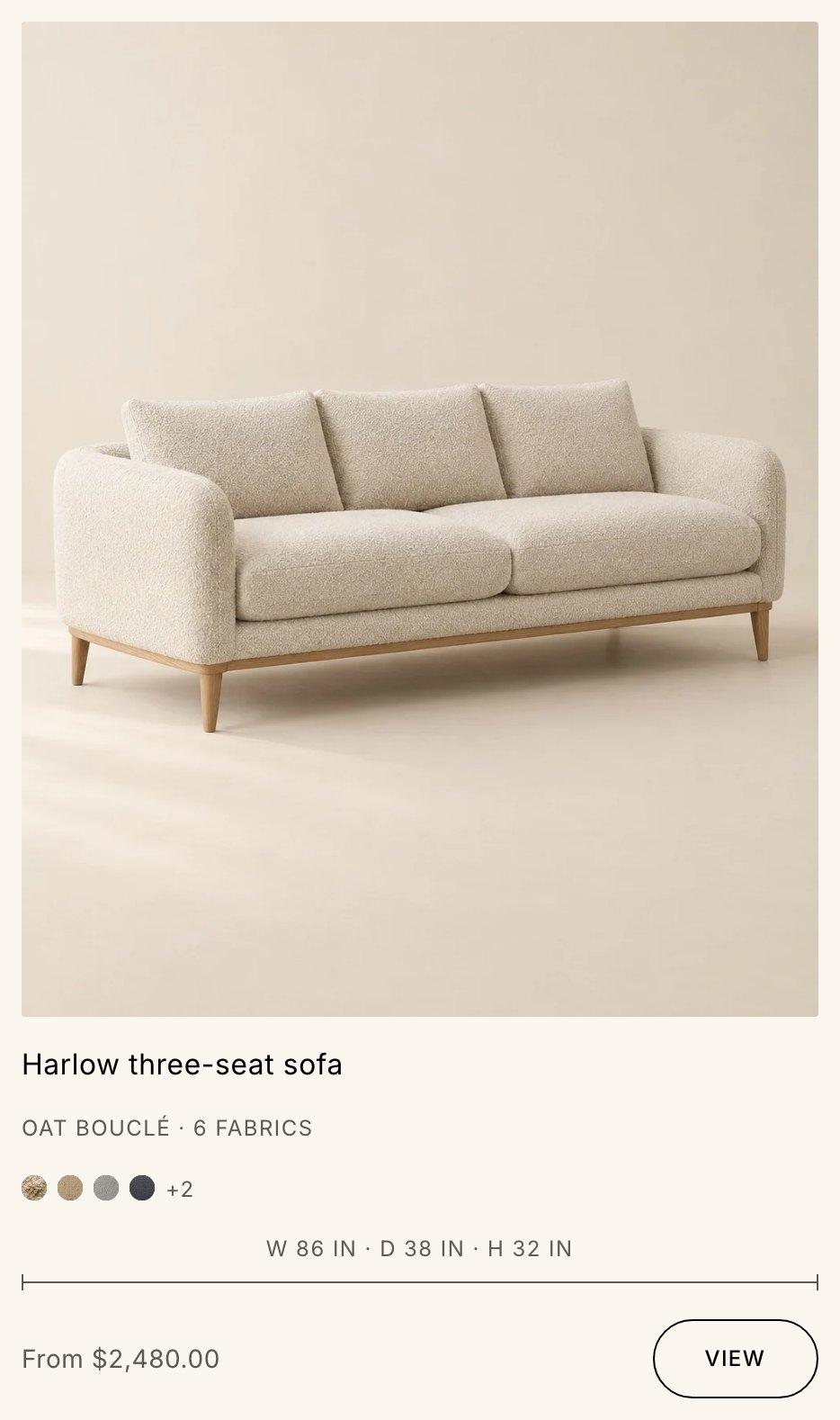
Width, depth, height, seat height and the narrowest point show as a dimension line on product cards, a table on the product page and lines drawn on the first product image. Use Nook's metafields, or connect the ones your products already have.
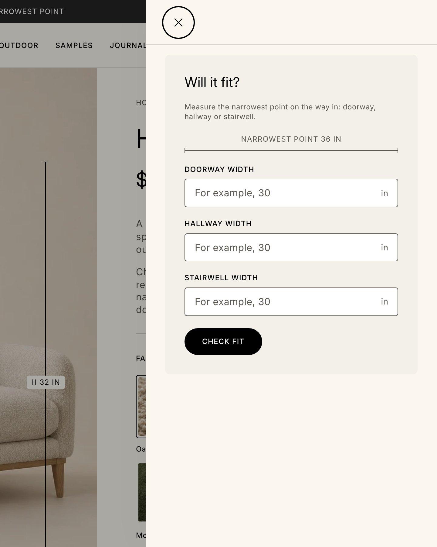
The fit note shows a piece's narrowest point. The fit checker compares it with the doorway, hallway and stairwell widths a shopper enters. It runs in the browser, and nothing is sent anywhere.
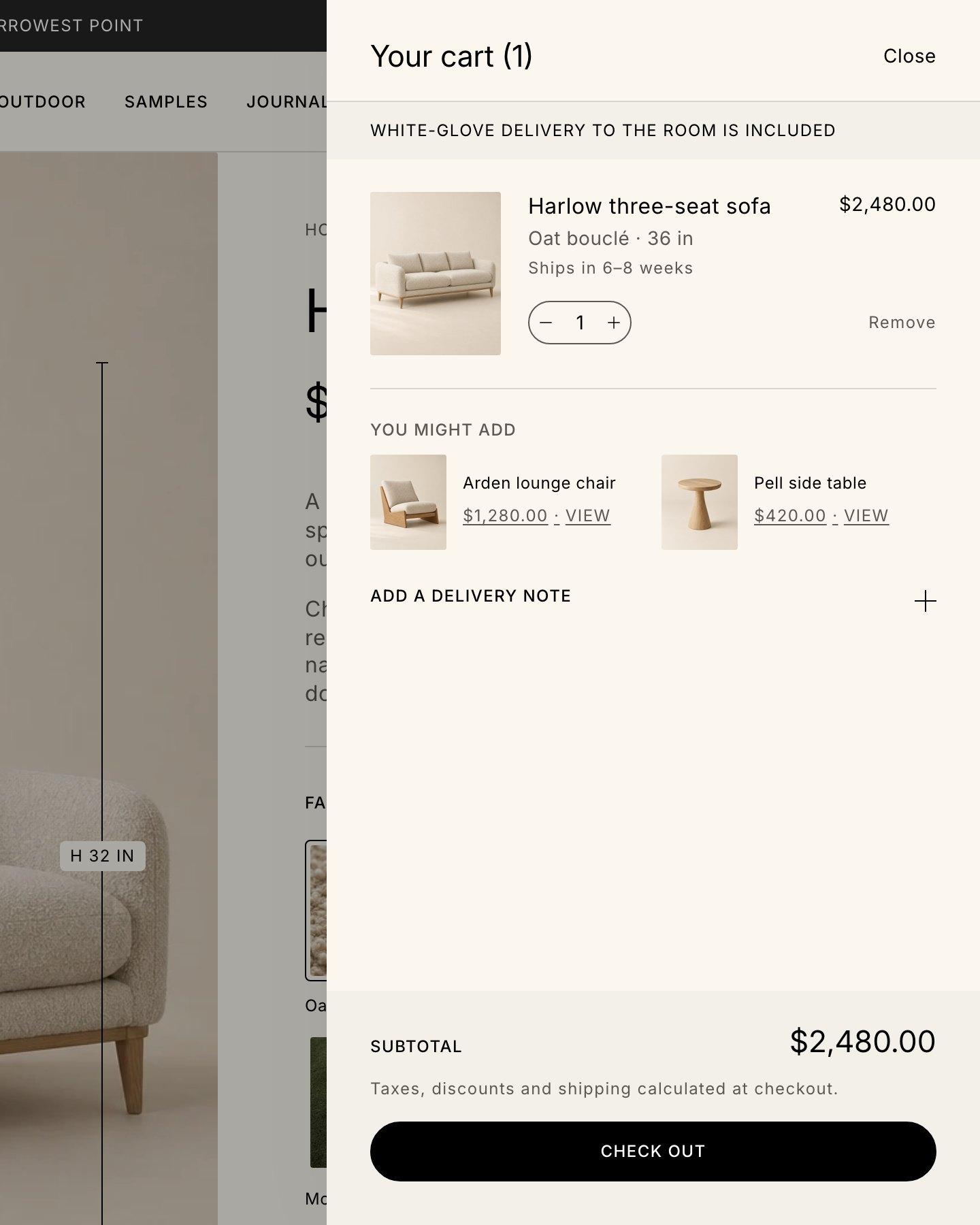
Each product can say when it ships. It shows in the cart, and on the product page once you connect it to a text block. Leave it empty and it stays out of the way.
Ships in 6–8 weeks
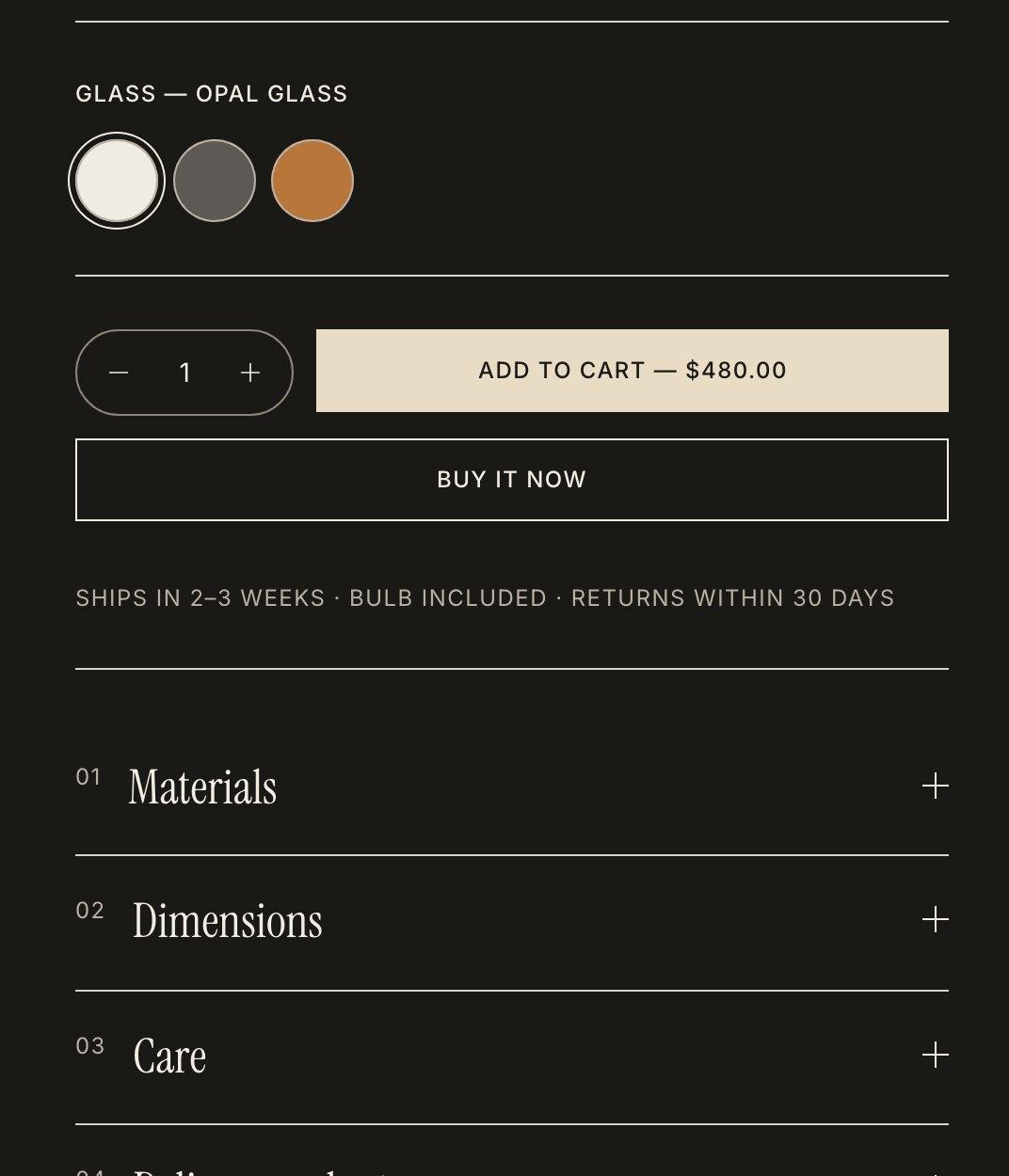
Swatches come from Shopify (opens in a new tab)'s category metafields: fabric photos as image tiles, flat colors as circles, like the glass options in the Umber style. Picking one moves the gallery to that variant's image.
Opal · Smoke · Amber glass
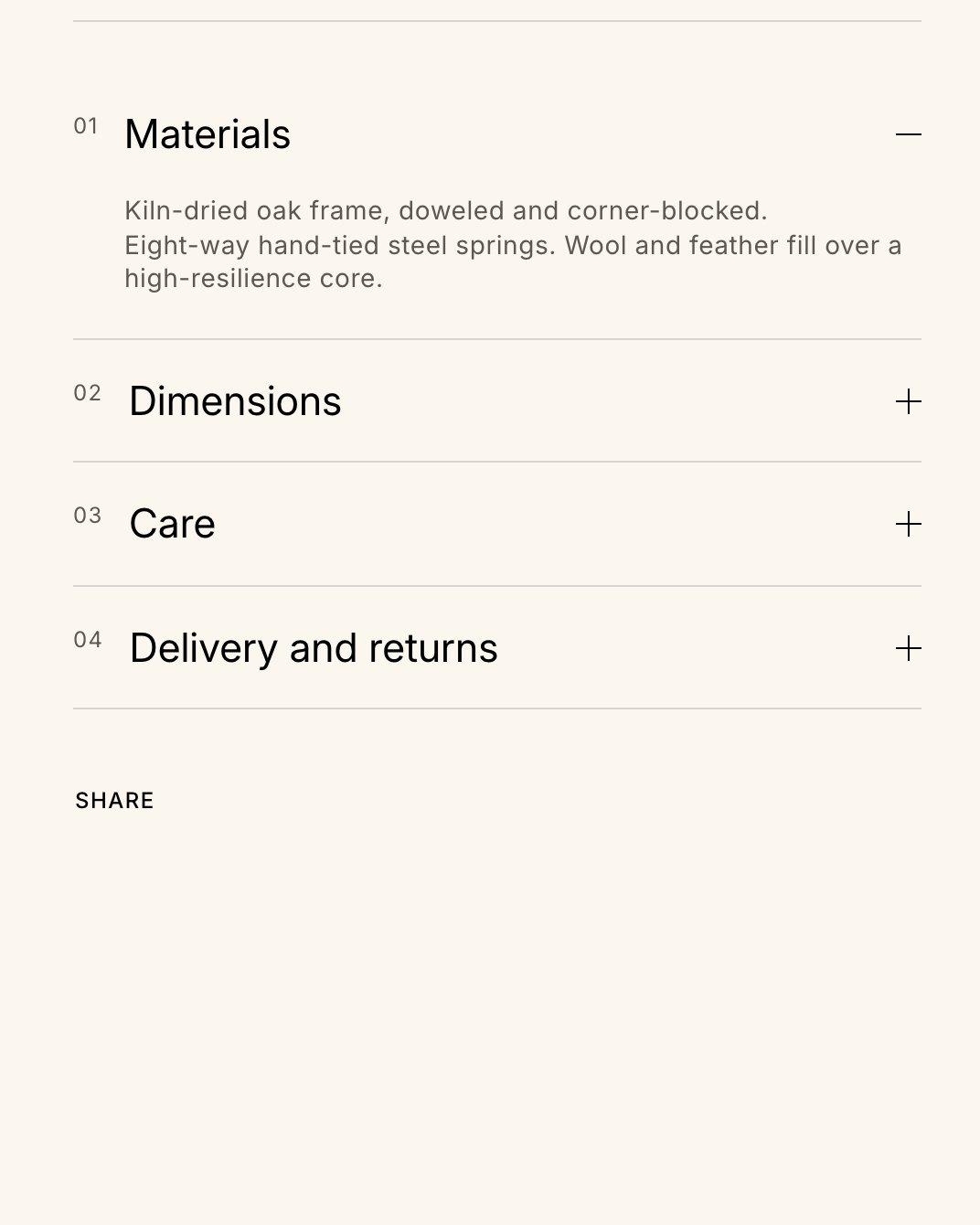
Materials and Care tabs connect to metafields, so each product shows its own. They stay hidden until they have content.
Materials · Dimensions · Care
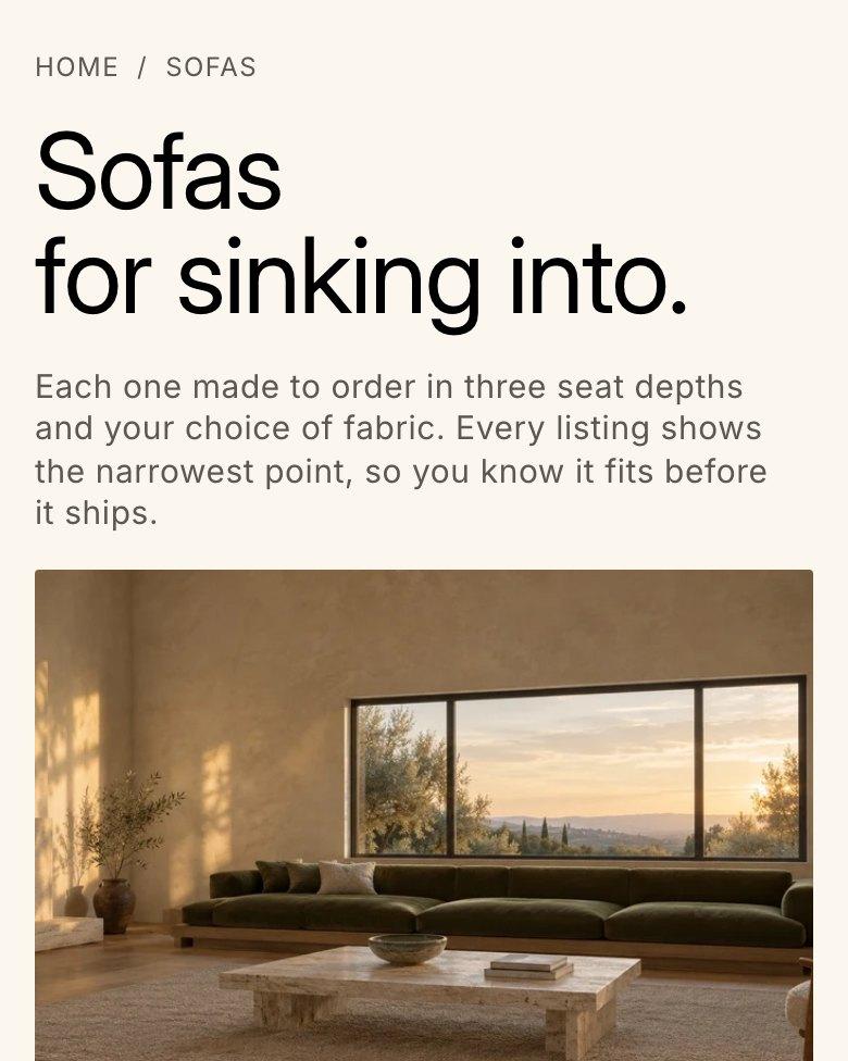
Each collection can open with a tagline and a few key figures, set in collection metafields.
Made to order
Section 3: The product page
A big purchase comes with questions. The product page answers them before the shopper has to ask, starting with the width and height drawn on the first image.
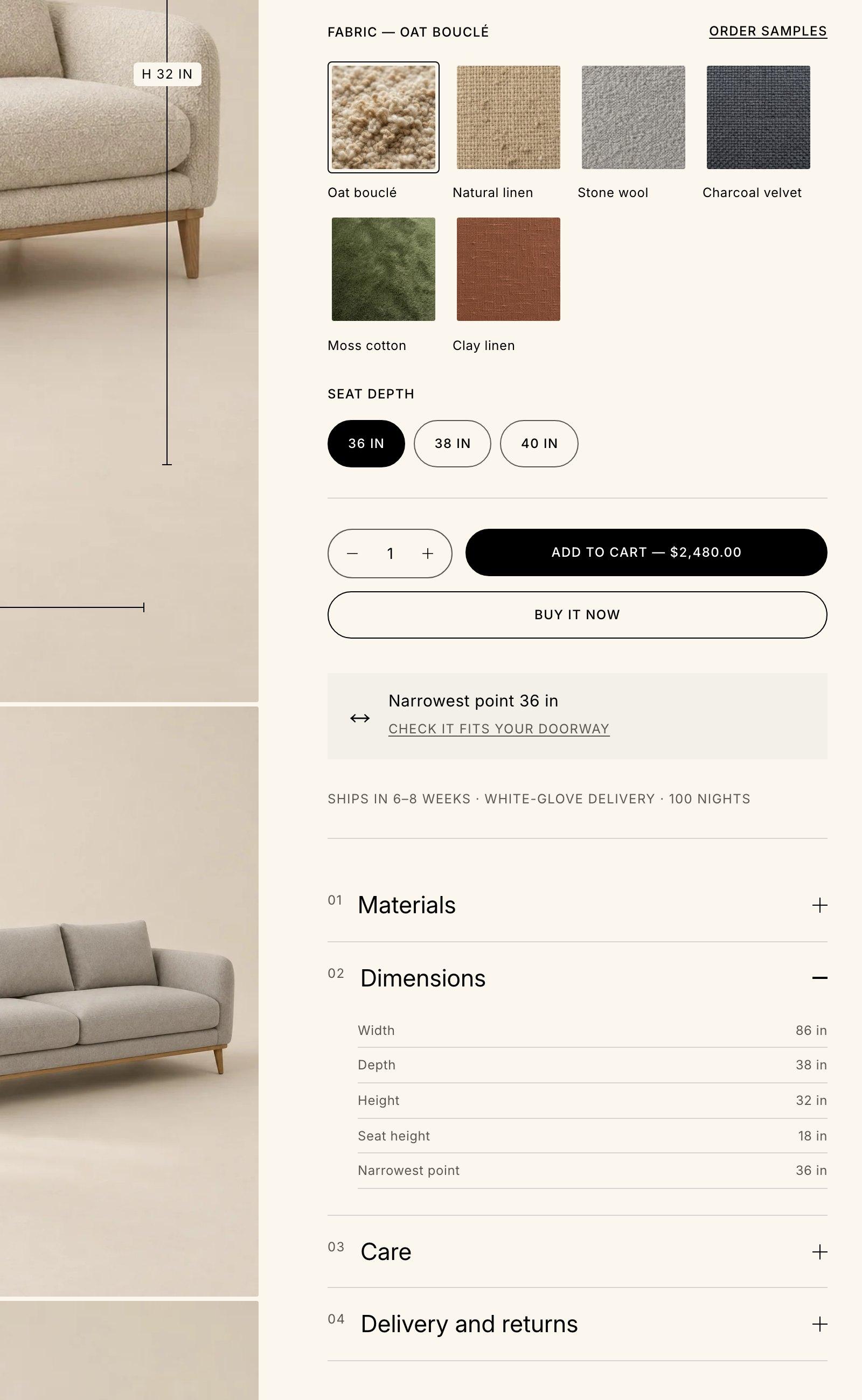
Image tiles for fabrics, color circles for finishes.
The narrowest point, with a link to check it fits through a doorway.
Ships in 6–8 weeks: in the cart, and on the page once connected.
Width, depth, height, seat height and the narrowest point, in their own tab.
A short tour of Nook
Nook demo store · 44 s
The Nook demo store in use: the mega menu, measurement lines on the product image, fabric swatches, the fit checker, the cart drawer with lead times, and predictive search.
Section 4: Editorial sections
Sections made for large photography and slow pacing, shown here in all three styles. Add them to any page in the theme editor, then rearrange them. The hero video and collection slideshow can fill the screen.


Section 5: Every section
Each one has its own settings and color scheme. The docs list every setting and block.
Section 6: Page templates
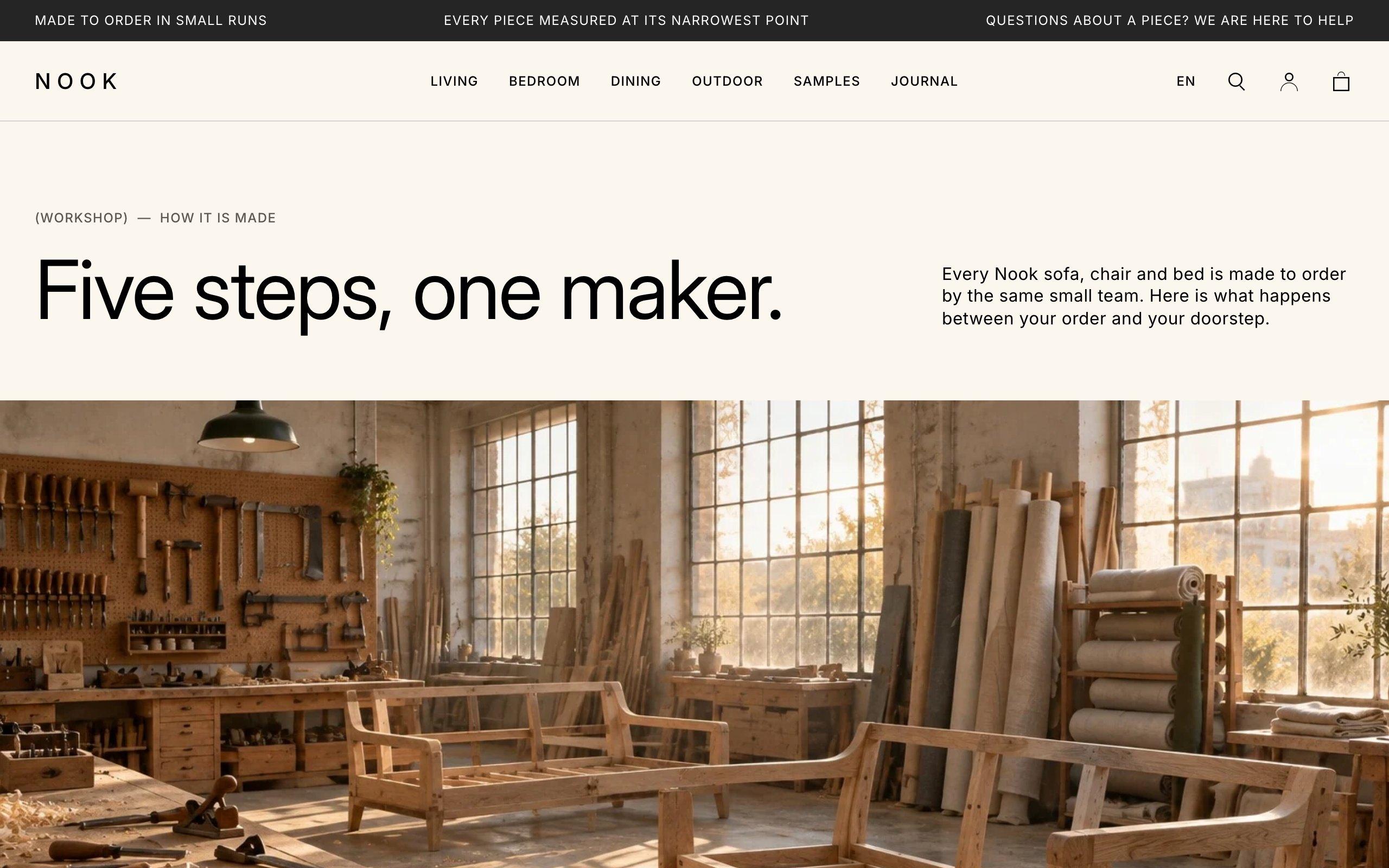
How your pieces are made, step by step.
Each one is built from the same sections you can add anywhere, so every part can be changed in the theme editor.
Section 7: Commerce
Nook includes the everyday features of a Shopify (opens in a new tab) store, written as vanilla JavaScript web components with no frameworks or third-party scripts.
Filters on collections and search results.
Search terms, products, blog posts and pages as you type.
Recommendations, a delivery note, unit prices and applied discounts.
A product's images and options, with an Add to cart button, in a side panel. Shoppers stay on the collection.
The cart, quick view, filters and menu slide in from the side.
Shop Pay, Apple Pay and Google Pay buttons in their own colors.
The Shop Pay Installments banner, when your store qualifies.
Purchase options from your subscriptions app, on product and cart.
Where a variant can be picked up, and how soon.
A recipient form, so shoppers can send a card by email.
Country and language selectors, for stores that sell in more than one market or language.
Mega menus on desktop and a drawer on phones, with up to three levels.
Sign in from the header, when customer accounts are on.
Shoppers can follow your store from the footer.
Showroom and store cards with an address, hours and a directions link.
Section 8: Accessible by default
Every control works with a keyboard, with a visible focus ring.
Color schemes meet WCAG AA contrast, and no text is smaller than 12px.
Buttons are at least 44px.
Live regions tell screen reader users when the cart changes.
With reduced motion on, fades and slides stop, scrolling text stops and the hero shows its still image.
Vanilla JavaScript web components. No frameworks, no third-party scripts.
Section 9: Docs and support
Setup, custom data, and every setting and section, written for the theme editor.
Read the docs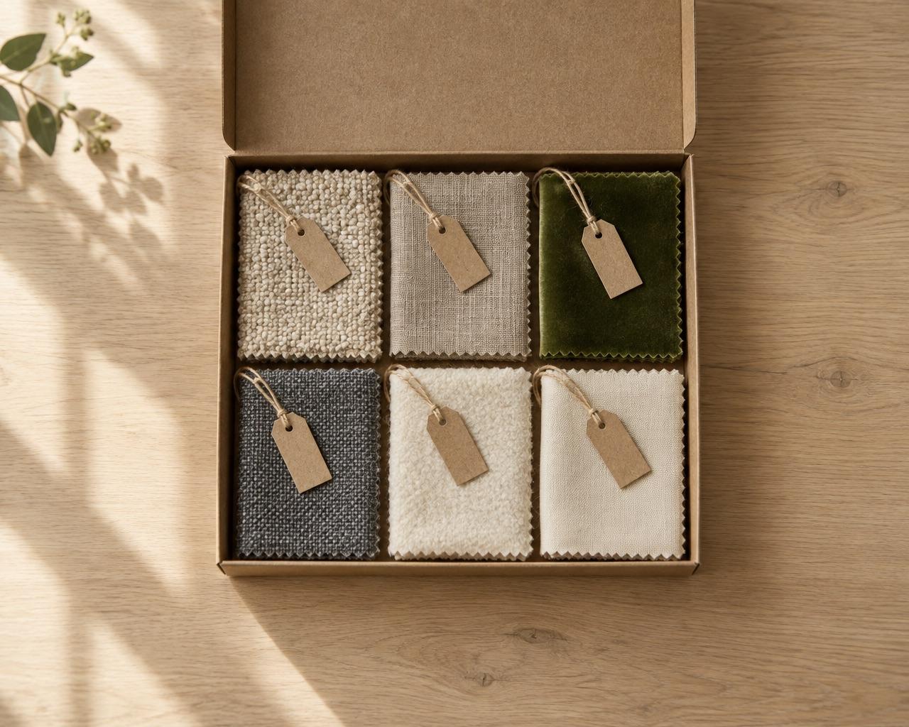
Send a message from the support form. You'll get an automatic reply, then an answer within two business days.
Contact support